One of the recurring topics discussed by the Democratic candidates during the debate last week was the threat of global warming climate change. This has been an ongoing topic of discussion for the past few years, and I’d like to provide a few comments related to the issue. First, I’m going to tell you that I’m neither a climate change “denier” nor am I convinced that man’s influence on the climate is as dramatic as many climate change alarmists say. More importantly, I’m not convinced that the potential impacts of climate change outweigh the costs many are proposing to combat it. I’ll walk through a few varied topics to try and show that the climate change debate isn’t much of a debate; it’s a monologue of those on one side of the argument.
The first item I want to discuss relates directly to the title of this post. In broad terms, I am immediately skeptical of someone who says “the science is settled”. I don’t think that anyone who makes that claim understands the scientific method. I assume most of you reading this studied this concept in middle or high school, but I’d like to provide a refresher – the point being that science is never really “settled”.
The main steps of the scientific method are as follows:
- Make an observation
- Ask a question about said observation
- Construct a Hypothesis
- Conduct an experiment to test the hypothesis
- Analyze the results of the experiment to accept or reject hypothesis
A key component of the experiments or tests performed is the attempt to isolate a single variable (i.e., keep all conditions but the key variable being tested constant). It’s important to note that if testing results do not confirm the hypothesis, the original hypothesis must be rejected, and a revised hypothesis should be subjected to testing.
With this rubric in mind, let’s discuss how the climate change alarmists seem to miss key components of the scientific method. When discussing the human impact on climate change, this generally refers to our collective carbon footprint, or the contribution of carbon dioxide to the environment as a result of the production of goods and industry. The first clear challenge in trying to test carbon dioxide impact on the climate is trying to isolate that variable. The global climate is influenced by a litany of factors, and while we know a lot about these factors, we can’t claim to understand with certainty the intricate ways that these factors work together and impact one another. Some other factors that are known to impact the climate are solar activity, convection, cloud cover, and complex oceanic models. As such, it’s nearly impossible to isolate the carbon factor with our current scientific knowledge.
This has led climatologists to produce computer models that make large assumptions on the impact of all the variables included. These assumptions are a red flag for me, and indicate a flaw in the attempt to “validate” the man-made climate change hypothesis. (That being said, I can concede that using computer models may be the only way to attempt to test and predict the impact of variables on the climate.)
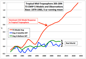
However, even conceding that point, we find other issues. One relevant issue is the fact that all the climate models being used by the Intergovernmental Panel on Climate Change (IPCC) have overestimated the warming of Earth. In fact, when using their current model they are also unable to accurately calculate historical temperature levels.

This raises a fairly obvious question – if their current “hypotheses”, as translated to their models, cannot be validated using hard data, why would we consider the hypotheses valid?
Considering that this is *just a blog*, I’ll move onto a couple of other items I’d like to discuss. We often hear the statement in news media that “97% of scientists agree” that climate change is real. That’s a bit deceiving. A commonly cited original source of this figure was a 2009 article in Earth & Space Science News, Examining the Concensus on Climate Change, by Peter T. Doran and Maggie Kendall Zimmerman. The article presented the results of a survey that was taken by 79 scientists with a focus in climatology and consisted of only two questions. The first question was whether they thought that global temperatures have risen. This point isn’t really a major point of contention for most, even by people who are skeptical of alarmists’ claims of dangerous climate change. Inasmuch as we are not living in an Ice Age, global temperatures have risen over time.
The second question was whether humans were a contributing factor. Again, not something that lots of people would argue – I think most people understand the concept that a factory burning fossil fuels releases carbon dioxide emissions that would not exist at such concentration levels without human intervention. However, identifying humans as a contributing factor does not logically lead to the conclusion that they are the primary factor. The combined, agreed upon factors of human influence and increase in temperature do not result in a doomsday scenario, but have been marketed as such.
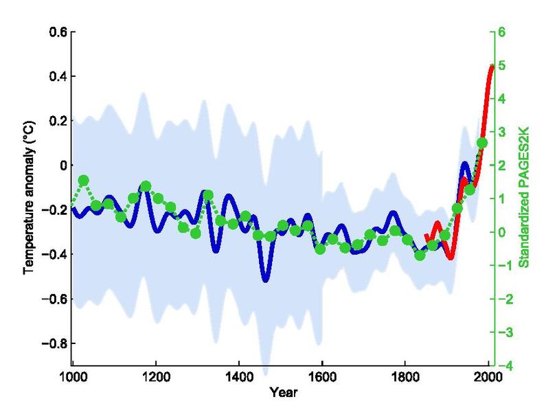
Another piece of evidence commonly cited by climate alarmist claims is the infamous “hockey stick graph”.

I’ll concede that if that graph were accurate, there would certainly be cause for concern. Once again, however, there are some serious problems with the data that was used to create it. Unfortunately, the science community doesn’t have data sets that measure historical temperature levels as far back in history as is needed to construct the graph. Given that lack of information, the scientists that constructed that graph used “proxy indicators” as stand-ins for actual temperature measurements. Here’s the issue – if two of these “proxy indicators” were removed from the formula to create the graph, the alarming hockey stick curve disappears.
The most damning piece of evidence that challenges the “hockey stick graph” validity is a study done by Stephen McIntyre and Ross McKitrick. Based on their study, they determined that the statistical method used for combining all of the data sets that created the graph was deeply flawed. The method for combining the data was done in a way that it would select data sets that had any sort of hockey stick shape and overly weight that data set. In practice, this method would naturally create a hockey stick shape graph using almost any set of data.¹
Just because I believe that there are major flaws in the way climate change alarmists are justifying their claims, it doesn’t mean I’m not concerned about the possible impacts of climate change. However, the dominant conversation only discusses the negative consequences and never covers the possible benefits. One possible benefit that is being observed is the increased “greening” of the planet. As most people know, C0² is food for plants. It’s been observed that the level of vegetation on the planet has increased by 6% from 1982 to 1999.² With a continually growing global population and a need to provide food to the extra population, this would seem to be beneficial. I include this partially to highlight the one-sided nature of the climate change dialogue – I feel like I stand rather alone as neither a denier nor an alarmist, and I think there are a lot of interesting arguments out there being ignored.
Let’s take another step beyond the possible risks and/or benefits of climate change and examine the actionable solutions being proposed to prevent climate catastrophe. As we know, nothing is “free”, and these solutions do not come without their own set of negative consequences. The first major consequence is the increased costs of energy. While it may be theoretically feasible for well-developed, wealthy nations to incur these costs, these measures will still have a disparate impact on the poorest of their citizens. This is more dramatically apparent when you consider this from a global level. The poorest countries in the world do not have the capital to invest (or squander) in developing more expensive energy sources vs. using existing fossil fuels. Fossil fuels are by far the cheapest and most concentrated forms of energy currently available to us, and have done more to raise the quality of life in the world than many other factors (see chart below).

To try and deny these countries cheap energy sources because wealthy countries feel a responsibility to “save them” from climate change catastrophe seems unscrupulous to me. The only other option is for wealthy countries, like the US, to subsidize those costs. Other countries – take note! But from a US perspective, the federal government does not have the right to mandate that I, and my tax dollars, should be footing that bill.
We’ve faced many “impending doom” scenarios over the course of recorded history, and to-date, none have come to fruition. In the 1970’s, there was an alarm over global cooling – that catastrophe didn’t materialized. In 1968, as documented in Stanford Professor Paul Ehrlich’s best selling book The Population Bomb, many thought that the planet would be over-populated by the 1980’s and that there would be widespread food shortages and famine. Judging by the waistlines of many Americans, I can tell you that we certainly haven’t seen a shortage of food. Food shortages exist in alarming degrees elsewhere, admittedly, but I’m talking about the crisis theories from a global scale.
If you can find me a weatherman that can accurately tell me what the weather will be next month (good luck there), I’ll begin to concede that we have a thorough enough understanding of the climate to make accurate warnings for impending climate doom. Until then, I’ll continue to take the evidence presented and try to put it in its proper context. A thousand foot view of the facts is helpful, but it’s often the granular details that get ignored. I’m never going to be able to look at a graph or model without the inherent need to view and contextualize the data it represents. I’d like to think I do my best to shield myself from what Friedrich Hayek called, “the pretense of knowledge”. You may not agree with me, but you owe it to yourself to do the same.
¹ McIntrye, Stephen & McKitrick, Ross (2003). CORRECTIONS TO THE MANN et. al (1998) PROXY DATA BASE AND NORTHERN HEMISPHERIC AVERAGE TEMPERATURE SERIES. Energy & Environment, Volume 14, Number 6
² Nemani, R.R., Keeling, C.D., Hashimoto, H., Jolly, W.M., Piper, S.C., Tucker, C.J., Myneni, R.B. and Running, S.W., 2003. Climate driven increases in global terrestrial net primary production from 1982 to 1999. Science. (June-06-2003).